 Earlier last week, Mozilla updated the Firefox 3.7 wiki to show potential design changes for Firefox 3.7, and today, updated their wiki to show new mock ups for Firefox 4.0 Windows designs.
The designs are changed to fit better into Windows 7 - as they want to "embrace glass" which is a major goal of Mozilla for the next Firefox release, as well as making them feel more a part of the OS. The designs also work on Windows Vista. A separate design would be in place for lower versions of Windows.
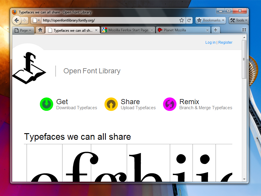
The images below show the ideas that the Mozilla team has, for some potential tab layouts/UI redesigns. Remember that these mock ups are different than the 3.7 ones posted last week. Compare them on the Mozilla Wiki.
Version A - Tabs-on-Bottom
Possibly add a Bookmarks widget as an upfront replacement for the Bookmarks menu/Bookmarks toolbar (option to turn those on would remain).
Version B - Tabs-on-Top
The more contentious Tabs-on-Top concept.
Positives
Negatives
Positives
- Save Vertical Space
Efficiency/Remove Visual Complexity - Right now the tabs have to be connected to something. So we are adding an extra visual element for them to connect to.
Shorter Mouse Distance to Page Controls
Negatives
- Breaks Consistency/Familiarity - Moving things confuses existing users.
Title is MIA - With the space removed from the titlebar you only get the truncated version in the tab.
Longer Mouse Distance to Tabs - Takes longer to mouse to a tab.
Lost Space - Sandwiched in between the application icon and the window widgets you lose some space.
Combo Stop/Refresh/Go Button.
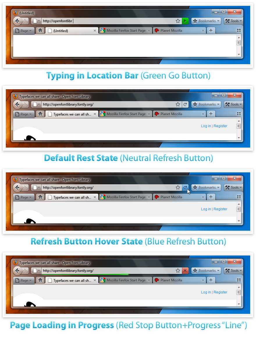
Attached at the end of the location bar.
Turns green when you start typing.
Blends with the location bar when at rest.
Turns blue on hover.
Turns red when a page is loading.
The proposed iconography is mostly colorless. Adding color to these temporary action driven buttons will make it more obvious something is going on.
No comments:
Post a Comment